GROOVE MAGAZINE
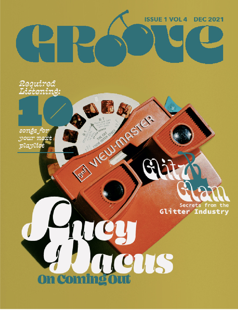
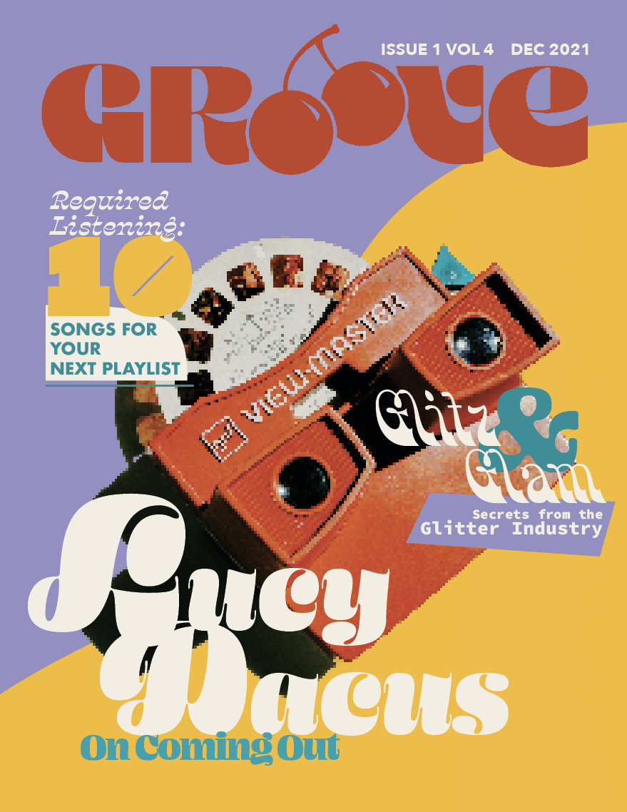
PUBLICATIONGroove is a conceptual magazine for imaginative readers who enjoy music, travel, thrift store fashion, and unique stories. The visual identity is inspired by 1970’s graphics and revival typography, and is characterized by bold shapes, a sense of energetic movement, and vivid color. The inspiration for Groove came from something as simple as a haircut—a ‘70s shag sent me on a deep dive into the fashion, textiles, and advertising of the decade.
The Groove cover received an honorable mention in the Graphis New Talent Annual 2022.

PROCESS
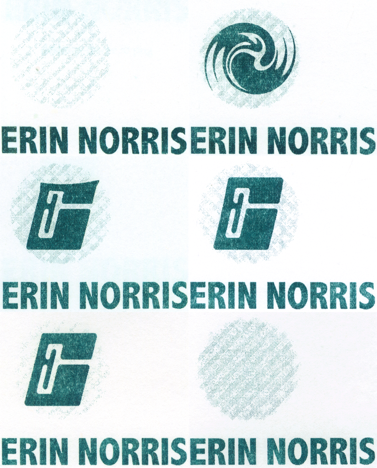
I found the type used for the Groove masthead in a 1979 Dover Clip Art Series book titled Headlines, which features stock paste-up messaging such as “Never Before...Never Again At These Low Sale Prices” and “Stop! Look! Price War” and “Halloween Fun & Games Funny Hats.” I digitally scanned the pages with this typeface, and isolated the letters to arrange the lock-up. The E was reworked by me to match style, improve legibility, and better suit the playful spirit of the magazine. The cherry illustration was also refined throughout the process.

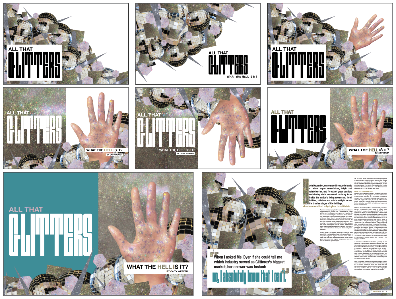
I selected the Glitter feature article, originally published in the NYT, for its playful copywriting and for the mysterious line that has struck me since I first read the article several years ago—“When I asked Ms. Dyer if she could tell me which industry served as Glitterex’s biggest market, her answer was instant: No, I absolutely know that I can’t.” Naturally, this line was used as a pull quote in the secondary spread.
Word lists helped to guide the imagery I explored during the design process. I also purchased around $50 worth of glitter.

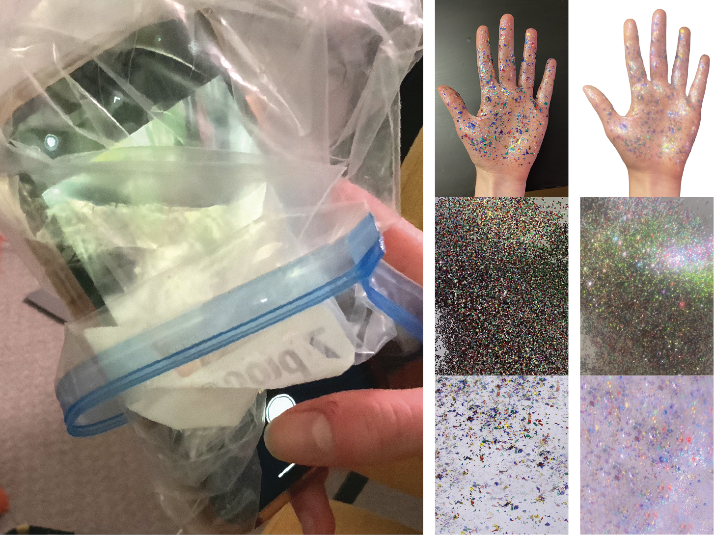
The majority of the photography used in the spread was shot by me. I used a plastic bag covering my phone camera to emulate a lens filter effect. The before-and-after effect is shown at right. The plastic softened the focus and created lens flares around the highlights in the image.
The feature opening spread went through considerable exploration, iteration, and development before I settled on a layout:
